Seeing the Curve
Hitters in baseball love fastballs. Give them a steady diet of fastballs in the strike zone and good hitters are in heaven. But they can get into a rhythm and start looking for the next fastball. A common trick for crafty pitchers is to make hitters "think fastball" and then freeze the hitter with a nasty curveball that dives past, leaving them feeling surprised by the change of pace.
Unfortunately for many hitters, failing to see and hit the curveball is a common problem. To counter this, hitters try to anticipate when (and if) the curve might be thrown. They watch the pitcher's motion, read the ball as it leaves the pitcher's hand, and often simply try to guess based on what they've seen the pitcher do before. In other words, hitters have a variety of indicators to use when strategizing how best to get a hit.
Investors also have a variety of indicators to use. Many are complicated but there's a deceptively simple indicator that is getting some press recently: the yield curve. We've discussed the yield curve before, but I wanted to offer some additional explanation. Click below to continue reading.
Bonds pay interest and based on the price you pay for the bond your rate of return is referred to as your "yield". There are many types of bonds as well as bonds of different maturities. The yield curve looks at the difference in yield of a particular type of bond over different maturities. For example, the difference between the yield of a 2yr Treasury and a 10yr Treasury.
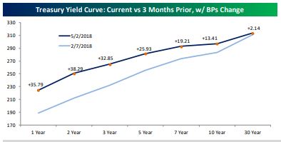
The 2yr currently yields about 2.5% while the 10yr yields just a hair under 3%, or about half a percent difference. You can extend this out to include, say, 3mo Treasurys, maybe the 5yr and out to the 30yr Treasury, while measuring the difference between each. You can either just acknowledge the numerical difference or plot them out to come up with a "curve" that visually represents the differences and how they are changing over time.
Economists and market strategists pay close attention to the differences along the curve but also the shape of the curve. Normally, when an economy is in growth-mode the yield curve slopes upward from left to right. This indicates, among other things, that bond investors are expecting economic growth and higher interest rates in the future.
But as the outlook changes and other factors come into play, such as the Fed raising short-term interest rates (impacting the left-side, or short-term part of the curve), the curve tends to "flatten" (as seen in the chart below) and the changing environment can make investors jittery.
This flattening isn't bad by itself, but it typically happens along the way to what's seen as a negative economic indicator, an inverted yield curve. The curve is said to be inverted when shorter-term bond yields are higher than longer-term.
You may have heard how the 10yr Treasury (a key benchmark for longer-term interest rates) recently touched 3%, a level not seen for years. While the benchmark quickly fell back below 3%, movement in the bond market this year has mostly been at the shorter-end of the curve (again, seen in the chart above). This is partly due to the Fed raising rates but also other economic factors.
What's the big deal if the yield curve is inverted? An inverted yield curve has forecast nearly every recession during the past 100 years. Interestingly, economists aren't sure why an inverted yield curve is so predictive, but they know it is by analyzing the data. They know, for example, while not targeting a specific date, an inverted curve implies that a recession is highly likely within the next 12 months or so.
What's the yield curve indicating now? Well, the curve may be flattening but it's still normally sloped (going from lower to higher, left to right). Additionally, the distance the curve needs to travel before inverting is still relatively high.
The Federal Reserve tracks this monthly, as seen in the chart below. You'll note that the black line dips to zero or below zero (an inversion) just before almost every recessionary period (the blue bars). Look at the whole chart and you'll see the cyclical nature of the economy. You'll also see that while we're trending toward an eventual slowdown or recession, we're not there yet.
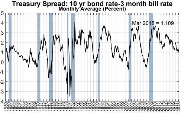
You may notice what seems like a clear recessionary trend in the chart above. While I'd agree, remember it can take awhile before the yield curve inverts, and it doesn't necessarily have to. But if it does, typically it's a year or so before any kind of recession might begin. And there are any number of forces that could extend this period, such as the new tax law, continued relatively low interest rates here and abroad, high levels of consumer confidence and near full employment.
Research indicates it's wise to trim back stock exposure in your portfolio while the yield curve is inverted. But more research indicates it's a bad idea to try to do so beforehand. So, what to do in the meantime? We have to continue monitoring the yield curve and other indicators. Like the hitter trying to make contact, we want to be ready when, or if, the curve inverts.
For an FAQ from the NY Fed about the yield curve, check out the following link:
https://www.newyorkfed.org/research/capital_markets/ycfaq.html#Q19
Have questions? Ask me. I can help.
- Created on .


