Perception Gap

There’s a perplexing dynamic playing out between how people feel about their own financial situation compared to how they see everyone else’s. This shows up in private conversation and in national surveys where people report feeling pretty darn good about their own finances while also reporting that the world around them seems to be falling apart a little more each day. Maybe these two things (positive me, negative you) can exist simultaneously but it’s hard to imagine them doing so at extremes for very long.

This appeared in two different places recently and I wanted to share some snippets with you. First, the Federal Reserve updated its annual Fall survey last month for 2021. They’ve been doing so since 2013. Second is a monthly survey conducted by my research partners at Bespoke Investment Group, in this case the data goes back to 2014.

The Fed’s survey found that Americans, at least on average, were doing quite well last Fall. Their personal financial well-being had improved from 2020 which, as the report suggests and makes intuitive sense, ties into the ongoing economic recovery from the pandemic and many months of government money flowing into lots of households. Accordingly, more Americans reported being able to pay cash to cover a relatively small, unexpected bill, whereas even pre-pandemic they would have needed to whip out their credit card.

But amid this positive, even rosy, assessment lurked the glaring and perplexing issue The Atlantic recently called the “everything is terrible but I’m fine” perception gap. The piece suggested that this could simply be part of human nature, that we’re wired to be “individually optimistic and socially pessimistic”. If that’s true I don’t pretend to know why. Maybe it’s obvious to you but the gap exists and, at extremes, can have real world implications for the economy and, by extension, the markets. This is especially true when negative sentiment gets overblown.

Here's a chart and a few sections from the Fed’s report and a link to the whole thing is below if you’d like to read more.

… Despite persistent concerns that people expressed about the national economy, the survey highlights the positive effects of the recovery on the individual financial circumstances of U.S. families.

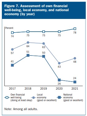
In 2021, perceptions about the national economy declined slightly. Yet self-reported financial well-being increased to the highest rate since the survey began in 2013. The share of prime-age adults not working because they could not find work had returned to pre-pandemic levels. More adults were able to pay all their monthly bills in full than in either 2019 or 2020. Additionally, the share of adults who would cover a $400 emergency expense completely using cash or its equivalent increased, reaching a new high since the survey began in 2013…

… In the fourth quarter of 2021, the share of adults who were doing at least okay financially increased relative to 2020. With these improvements, overall financial well-being reached its highest level since the survey began in 2013.

Seventy-eight percent of adults were either doing okay or living comfortably financially, the highest share with this level of financial well-being since the survey began in 2013.

Forty-eight percent of adults rated their local economy as “good” or “excellent” in 2021. This share was up from 43 percent in 2020 but well below the 63 percent of adults who rated their local economy as “good” or “excellent” in 2019, before the pandemic…

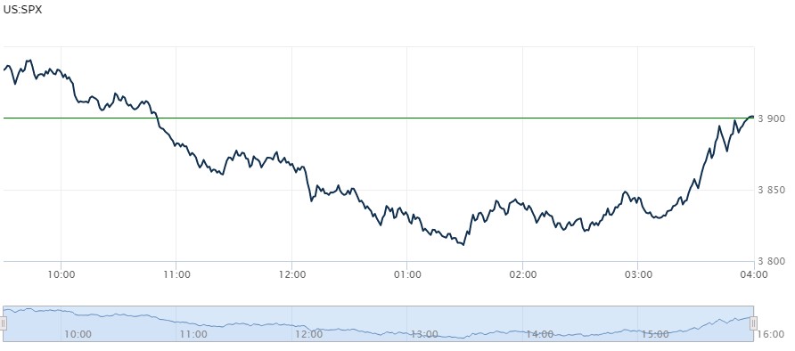
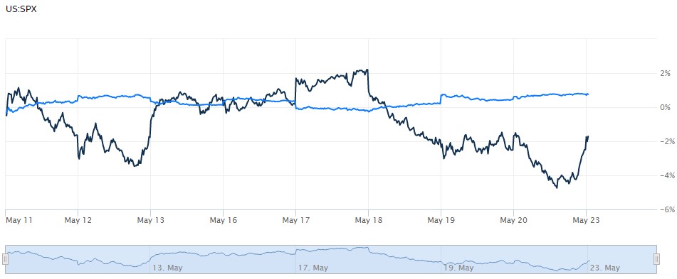
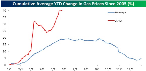
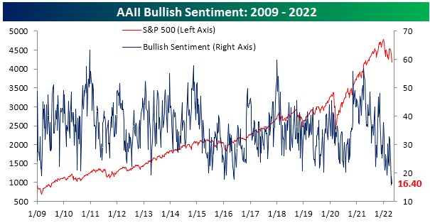
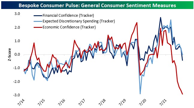
The Fed survey was conducted last Fall before inflation flared up, before Russia invaded Ukraine, and before the stock and bond markets had one of their worst starts to a year ever. So if the survey was done now it might look something like Bespoke’s results below: declining personal confidence and the perception gap widening even faster.

From Bespoke…

Consumers are extremely negative on the US economy in general. As shown below, economic confidence is a full standard deviation below the previous record low for the data dating back to July of 2014. Typically, general economic confidence is consistent with confidence in consumers' personal finances and expected spending on discretionary items, but over the past year the disconnect has gotten truly enormous. While confidence in personal finances and expected spending are basically at average levels, economic confidence has continued to plunge.

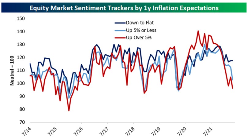
The reason for the collapse in economic confidence is inflation. In the chart below, we show economic sentiment over time by category of inflation expectations. Consumers that expect deflation are by far the most optimistic about the economy, while those who expect manageable inflation (up 5% or less) are more negative. Consumers that expect high inflation over 5% have seen sentiment collapse deep into negative territory. The bottom line: the higher consumers expect inflation to get, the worse they feel about the economy.

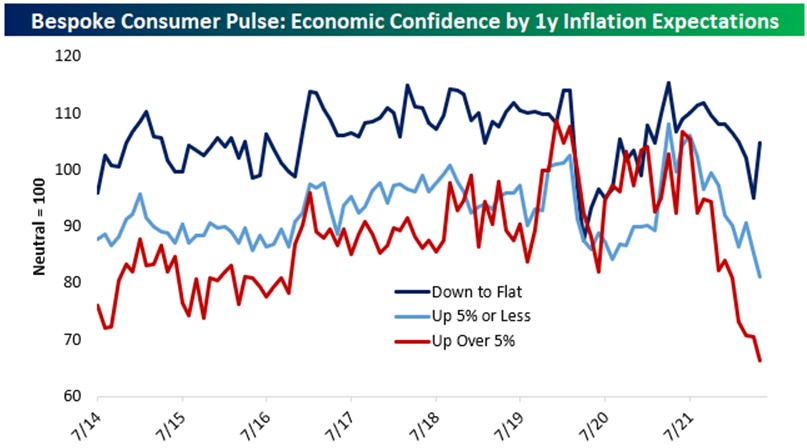
Inflation concerns have caused extremely negative sentiment readings, and it's hard to imagine these readings getting too much worse as there's a floor in terms of how low they can go.  Therefore, barring a significant negative shift in the economy, this would suggest a higher likelihood of positive surprises (lower rate of inflation) than downside surprises at this point, and any cooling on the inflation front should result in a bounce-back for sentiment (and potentially the stock market).

Here’s a link to the Fed’s paper.

https://www.federalreserve.gov/publications/files/2021-report-economic-well-being-us-households-202205.pdf

And here’s a link to the opinion piece from The Atlantic on this issue.

https://www.theatlantic.com/newsletters/archive/2022/06/american-economy-negative-perception-inflation/661149/

Bespoke Investment Group is a subscription-based service, but you can follow them on the socials for free.

https://www.bespokepremium/interactive

Have questions? Ask me. I can help.

  • Created on .

Good News?

The rough patch for stocks deepened last week with the S&P 500 posting its seventh weekly loss in a row and almost touching bear market territory (a 20% loss from a recent high). Parts of the index, such as Consumer Discretionary and Technology sectors, are already there. In fact, the only two positive sectors so far this year through last Friday are Utilities and Energy, up about 1% and almost 49%, respectively. Otherwise, the next best (or least bad, depending on your mood) sectors are still down around 8% this year.

During times like these we often have to sift through the rubble to find silver linings. Here are a random few as I write on this Tuesday morning.

Major indexes like the S&P 500 eked out a positive close last Friday, even though they were down for the week. Stocks had opened higher Friday morning and, as has often been the case lately, promptly fell and seemed set to close on a dismal note. But then prices reversed higher in the last hour, even the last 15 minutes, of the trading day. This phenomenon has been around for a while and tends to be when the so-called smart money shows up.

Here's what this looked like on Friday. The smart money can go either way, but this sort of last-minute buying is positive. We got confirmation yesterday when futures were higher before the morning bell and the big indexes stayed higher for the whole session – a real anomaly these days. Markets are set to open lower again this morning, but at least Friday shows there are willing buyers out there.

Retail investor sentiment has understandably gotten worse in recent weeks. How can that be a silver lining? Simply, extreme retail investor “bearishness” is a contrarian indicator. Fanning the flames, major financial news outlets are referring to current market volatility with terms like biblical, carnage, and even lost decade. Lost decade? There have been exceptionally few rolling ten-year periods when a well-diversified investor has lost money in the stock market. In fact, to go negative you’d have to end your 10yr period in the middle of the Great Depression or the Great Financial Crisis, according to Crestmont Research. There will always be those peddling doom and gloom, and the rising volume of their hyperbole is probably a contrarian indicator too.

This economic indicator heatmap from JPMorgan contains lots of small type, but just look at the color difference from 2020 on the left to this year on the right – from red to green, poor to positive. The outlook is mixed and there are various opinions about a recession in the offing. “Recession” is defined by the National Bureau of Economic Research as a significant and widespread decline in economic activity lasting more than a few months, and its beginning and ending dates are only determined afterwards. Activity usually peaks heading into a recession and maybe that’s where we are now. But whatever comes next, our economy is still humming along even amid myriad issues.

The bond market seems to have found it’s footing after falling, sometimes in lockstep, with stocks for much of this year. Bond performance has been a gut punch for more conservative investors who rely on bonds for cash flow but also for stability within their portfolios. The following chart shows the last ten days for stocks, the black line, and bonds, the blue line. High quality bonds should perform like this when stocks are challenged, so the last couple of weeks or so is a return to normalcy. Let’s hope it lasts.

Also, bond investors are reassessing their fears of runaway inflation. There are many ways to gauge inflation expectations, and one way common in financial markets is to look at so-called breakevens in the Treasury Inflation-Protected securities, or TIPs, markets. These breakevens are trying to price the future direction of the Consumer Price Index and suggest lessening inflation pressure across the 2yr, 5yr, and 10yr timeframes. The chart below from Bespoke Investment Group shows this clearly, especially for CPI in the short-term. Maybe inflation ends up waning because we’ve entered a recession, or maybe it dies down for a host of other reasons. Either way, slowing inflation would be welcome by just about everybody.

Here's a link to the page about 10yr rolling periods. This isn’t a guarantee, just a historical perspective on the importance of thinking like a long-term investor – it’s a marathon, even an ultramarathon, and not a sprint. Sprinting would be like buying NFTs just because your favorite boxer gets paid to “influence” you to do so. Don’t let that be you.

https://www.crestmontresearch.com/docs/Stock-Rolling-Components.pdf

And here’s a link to the heatmap above so you can see the details more clearly.

https://am.jpmorgan.com/us/en/asset-management/adv/insights/market-insights/market-updates/on-the-minds-of-investors/are-we-in-or-headed-towards-a-recession/?email_campaign=302853&email_job=315388&email_contact=003j0000018XcwiAAC&utm_source=clients&utm_medium=email&utm_campaign=ima-mi-publication-WMR-WEB-OTM-MSR-05232022&memid=7220927&email_id=60820&decryptFlag=No&e=ZZ&t=613&f=&utm_content=Readthelatest

Have questions? Ask me. I can help.

  • Created on .

Notes on Rates

Well, last Wednesday was a big day for the markets as the Fed Chair was having his presser to discuss Fed policy and their outlook. Investor mood turned ebullient for a few hours, but the markets have corrected that and then some since. One step up and two steps back. It reminds me of Springsteen and races I’ve run up steep slopes after a hard rain, each step seeming oh-so-futile until, eventually, but I digress…

Since interest rates are all the rage right now, let’s spend a few minutes reviewing where we stand with three rate benchmarks and what’s expected by year-end.

Fed Funds Rate – 0.75% to 1% currently, 2.8% expected

This is the interest rate range at which banks and credit unions lend to themselves to meet reserve requirements, typically via overnight loans. The reserve requirements are set by the Federal Reserve and then the Federal Open Market Committee (a smaller group within the Fed) usually meets eight times a year to set the rate range. Higher rates are meant to slow the flow of money in the system, while the opposite is true for lower rates. “Fed funds”, in a sense, is the axis around which the financial world spins.

Fed funds was lowered to essentially zero during the Great Financial Crisis and the FOMC didn’t start raising it until late-2015. From there the rate was being raised incrementally to about 2.5% as we entered 2020. Then the FOMC again took the rate back to zero when covid hit and it’s taken until now for them to start raising.

Prime Rate – 4% currently, 5.8% expected

We read about the fed funds rate and how it moves markets, yet we’re more impacted by the prime rate day-to-day in the real economy.

Prime is an average interest rate compiled by the Wall Street Journal after surveying our largest banks. It’s thought of as the lowest rate offered by these banks and is typically 3% higher than fed funds. Pre-pandemic, the prime rate was 5.5% since fed funds was at 2.5%. Then it spent many months at 3.25% because the fed funds rate range was 0% - 0.25%. Now we’re back up to 1% for fed funds and a 4% prime rate, that same 3% spread. (I don’t know why it’s a 3% spread, because it doesn’t have to be so far as I’m aware; it just seems generally agreed to in the “modern” era. If you know the history, please enlighten me.)

Here's a chart from the St. Louis branch of the Fed that shows the relationship between fed funds and the prime rate over time.

From there it’s all about the spread you pay over prime. Maybe competition makes this smaller for some customers, or maybe a promo rate is less than prime, but currently the direction is higher for all. Investors are expecting the fed funds rate to hit 2.8% by year-end. If so, prime should then be at 5.8% and may continue rising into next year. Still historically low but a big change in a short time.

All this makes new borrowing more expensive than it was even just a few months ago, and impacts auto loans and credit cards, for example. Auto loan rates are about 4.5% nationally, below a pre-pandemic high of about 5%, but still a good deal more than last year. Credit card rates, at least on average, haven’t moved substantially higher yet, but are still north of 16%, according to Bankrate.com.

Prime also impacts some adjustable-rate mortgages and equity lines of credit. There are a variety of so-called reference rates besides prime, but they’re all moving in the same direction. If you have an ARM or a HELOC you should look at your loan paperwork to see what your reference rate is and how often your lender can increase your payment. Most ARMs have a cap for annual increases, which is great since we’re looking at a potential 2+% increase just this year.

10yr Treasury – 3.1% currently and maybe 3.2% expected by year-end (This is driven entirely by markets whereas the prior two benchmarks are set by people at the Fed and big banks.)

Another key benchmark for rates on longer-term loans is the yield on 10yr Treasury securities, wrapped up into something known as the Constant Maturity Treasury. Published by the Fed, the CMT is an average of yields on publicly-traded Treasurys with a 10yr maturity (and it’s published for different timeframes as well). The 10yr CMT doesn’t set mortgage rates but, instead, reflects the market that mortgage bonds have to compete in. Since the overwhelming majority of mortgages are packaged into bonds and sold to investors, the rates paid by borrowers have to keep up.

The 10yr CMT is now just over 3%, following the yield of the 10yr Treasury. That brings the average 30yr fixed mortgage rate to 5.6%, according to the Wall Street Journal, up from 3% or less a year ago. That adds about $122 per month on the principal and interest portion for every $100,000 borrowed. That has to hurt homebuyers who have been diligently bidding on, and often getting outbid on, homes as they watch rates rise in a seller’s market.

So what to make of all this?

Now is a great time to reevaluate your debts. Your fixed-rate mortgage from a purchase or refinance at pretty much any time before this year is going to be in good shape rate-wise. You typically need to save at least half a percent when refinancing to make the costs pencil out, so any rate below 5% is probably locked in at this point.

The same thinking applies to car loans of maybe 4% or below.

Credit cards – you’re not carrying a balance on credit cards are you? If so, and even though average rates on consumer credit haven’t moved a lot higher yet, they’re expected to, so you’ll want to get balances paid off as quickly as possible before that debt gets even more expensive.

Beyond that, and maybe a little bit in the weeds for this post, is to think seriously about taking money out of bonds to buy down (or pay in full) mortgages or other debts with higher interest rates. Longer-term expected returns on core bonds are a little over 3%, so it’s hard to justify borrowing for years at 5+% if you have bonds in non-retirement accounts. This is a facts-and-circumstances sort of thing but is definitely worth considering.

Have questions? Ask me. I can help.

  • Created on .

How High is Too High?

Memorial Day weekend was quite busy this year and I hope you enjoyed it. I took most of Monday off, so this week’s post is lighter than usual. With inflation still elevated and rising risk of recession, it’s interesting to watch what’s happening with prices at the pump and airfares as the summer travel season gets going. Here’s a handful of different data points and some charts for a quick check on the inflation-as-travel-deterrent question.

According to AAA, Memorial Day travel was expected to almost be back to pre-pandemic levels and the summer travel season should be very busy.

If by road, Memorial Day travelers faced a national average gas price of $4.60 per gallon, also according to AAA, but prices are pushing $6 in Sonoma County. Both prices have risen over 50% in the past year.

Gas prices typically go up heading into summer but are obviously a lot higher than normal. The following charts from Bespoke Investment Group detail average Memorial Day gas prices since 2005 and how current prices have shot much higher than the typical seasonal curve.

If by air, travelers were seeing limited options, canceled or rerouted flights, and a huge year-over-year ticket price jump. Jet fuel is up about 116% in the past year, according to an airline industry group, IATA, which of course contributes to higher ticket prices.

But airlines are also making up for ground lost during the pandemic. Even with input costs rising, this is still expected to be a very profitable summer as demand remains high. For example, United Airlines told stock analysts recently that it expects its revenue per seat mile to be around 25% higher this season than during 2019. That’s a huge increase for the airline while flying 14% fewer flights than pre-pandemic levels, according to Reuters. In other words, airlines like United are directly and indirectly passing increased costs through to customers because they can. The following chart from the St. Louis Fed shows the CPI for airfares through April, but just imagine the line steepening into May and probably into summer as well.

Higher prices for air travel likely caused some folks to hit the road instead, but an average of over 2.2 million people still flew each day this holiday weekend, down about 8% from the same time in 2019 but up substantially from pandemic lows, according to data from the TSA.

So what to make of all this? Add it all up - inflation, the shaky stock and bond markets, recession fears, horrific events at home and abroad – Americans still want a vacation and after too long without, no cost seems high enough to dissuade them. Does that kind of elevated consumer demand indicate a recession around the corner? Hard to imagine immediate recession risk, but maybe that’s just me being optimistic on a day memorializing those who gave all to defend our way of life.

Here are links to the data points I mentioned.

https://newsroom.aaa.com/2022/05/the-heat-is-on-memorial-day-forecast-points-to-sizzlin-summer-travel/

https://www.iata.org/en/publications/economics/fuel-monitor/

https://www.tsa.gov/coronavirus/passenger-throughput

Have questions? Ask me. I can help.

  • Created on .

Where the CPI Comes From

Last week was a busy one for the markets. The S&P 500 had its sixth weekly loss in a row on lots of news and volatile trading. Stocks snapped back a bit as the week ended, which is encouraging, and futures are brighter as I write this morning. The crypto space suffered a thwacking last week as well after a highly-speculative-but-marketed-as-safe “stable coin” basically bit the dust. Bitcoin, the comparatively stodgy digital asset, got hit as well but has since found its feet. And the much-maligned bond market finally picked up some slack by staying positive when stocks were down.

Also last week we learned that inflation rose at an annualized rate of 8.3% in April. This is slightly slower than the 8.5% Consumer Price Index in March. Energy, apparel, and used vehicle costs declined during the month, but everything else tracked by the Bureau of Labor Statistics was higher on average. 

The CPI numbers move markets and are upsetting for many, so it’s helpful to get a better understanding of how they’re derived. There’s a bunch of reading material on the BLS’s website and I’ve copied some below as a summary. Additionally, there was a great piece from The Wall Street Journal last week covering BLS staff who go into the field to collect data. I’ve copied some parts from that article as well and a link is below if you’d like to read more.

Assorted information from the BLS [notes and emphasis mine] –

The CPI is widely used as a cost-of-living index, which answers the hypothetical question concerning what expenditure level is needed to achieve a standard of living attained in a base period at current market prices. [In other words, the CPI is trying to approximate how a typical person’s cost of living changes over time. The BLS doesn’t know the value of your time, your personal buying habits, or the substitutions you make as prices rise. This is part of the reason why people often feel like their personal inflation rate is much higher.]

The CPI focuses on the consumer experience of inflation, therefore the price sought is typically the consumer's out-of-pocket price, including sales and excise taxes.

The CPI is calculated in a two-stage process. First, basic indexes are calculated; these are indexes for specific item-area combinations. Ice cream and related products in the Chicago-Naperville-Elgin metro area are an example. These are structured by item category and geographic location. In the second stage, the basic indexes are aggregated into broader indexes, all the way up to the all items U.S. city average index. Thus, the CPI has both a geographic structure and an item structure.

Expenditure items are classified in the CPI into more than 200 categories, arranged into 8 major groups [that are unique to the CPI calculation process].

Eight major groups and examples of categories in each follow:

  • Food and beverages (breakfast cereal, milk, coffee, chicken, wine, full-service meals, snacks)
  • Housing (rent of primary residence, owners' equivalent rent [roughly what a homeowner would pay to rent their own home], utilities, bedroom furniture)
  • Apparel (men's shirts and sweaters, women's dresses, baby clothes, shoes, jewelry)
  • Transportation (new vehicles, airline fares, gasoline, motor vehicle insurance)
  • Medical care (prescription drugs, medical equipment and supplies, physicians' services, eyeglasses and eye care, hospital services)
  • Recreation (televisions, toys, pets and pet products, sports equipment, park and museum admissions)
  • Education and communication (college tuition, postage, telephone services, computer software and accessories)
  • Other goods and services (tobacco and smoking products, haircuts and other personal services, funeral expenses) 

[CPI] directly affects the income of almost 80 million people. Social Security benefits as well as military and Federal Civil Service pension payments are indexed to the CPI. In the private sector, many collective bargaining agreements tie automatic wage increases to the CPI and some private firms and individuals use the index to keep rents, alimony, and child support payments in line with changing prices.

Additionally, for analytical purposes, the CPI is also divided into food, energy, and all items less food and energy. The CPI for all items less food and energy gets considerable attention as a measure of underlying "core" inflation, which is not subject to the volatile movements of food and energy prices.

Now from the recent WSJ article –

READING, Pa.—Emily Mascitis has one of the most important jobs you never knew existed.  

As Americans’ monthly bills climb at the fastest rate in four decades, it is Ms. Mascitis’s work that confirms the $9 you just paid for a 4-pound bag of clementines isn’t an anomaly. 

Ms. Mascitis is an on-the-ground economist with the Bureau of Labor Statistics, one of 477 workers employed by the federal government to track changing prices for hundreds of thousands of goods and services every month. The culmination of their work is the Consumer Price Index, which moves markets and monetary policy and charts changes in the cost of living for millions of people. 

A typical day on the job might take Ms. Mascitis to a beauty salon to check the price of a blowout, to a jeweler to see what a strand of pearls costs and a funeral parlor to learn what it is charging for cremation services. It also gives her a front-line view on how broad economic forces ripple in the real world.

Prepandemic and before the rise in inflation, store managers—along with Ms. Mascitis’s own family and friends—didn’t take much interest in the numbers she was collecting.

Now, she says a grocery store or mechanic visit can take an extra 10 minutes as business owners complain to her about rising prices. Her husband looks to her for help cutting costs to feed and clothe their 10-person household. (Ms. Mascitis, a mother of six, is trying to curb her family clementine obsession: “We need to pick a less expensive fruit.”) Her friends ask for the inside scoop into the next BLS reading—something she can’t disclose under any circumstances as confidentiality is one of the core elements of an on-the-ground economist’s job.

Ms. Mascitis, 50, who has been working as a BLS price checker since 2013, describes her job as “a treasure hunt.”

Participation in the CPI is voluntary for businesses, so having a rapport with individual company owners helps, Ms. Mascitis says. As a branch chief, she helps recruit new small businesses as well as corporations to be part of the index. She also oversees 10 employees. 

The job of a price-checker is exacting. To price an item, workers go through an up to 11-page list of data points to make sure they are pricing the same item they did the prior month. A can of soup has 12 different specifications, including flavor, size, brand, organic labeling, material of the packaging and dietary features, such as sodium content. 

At a grocery store outside Reading, Pa., Ms. Mascitis introduces herself to the night manager and heads to the soup aisle to price a can of chicken noodle. She double checks to make sure it is the exact item she is supposed to record—If not, she could skew the accuracy of the entire index or make her data point unusable. 

“Do you see what I just did? I almost just ruined the whole thing,” she says, pointing to a teeny “low sodium” label on the can.

Next Ms. Mascitis heads to the frozen foods aisle, hunting for a noodle dinner. After rifling in the freezer, she resolves to ask the manager whether it is out of stock and says she will return. 

Supply-chain shortages have made it more difficult to check prices from month to month over the pandemic, since goods are often out of stock, Ms. Mascitis says. During the visit, an announcement over the grocery-store PA asked shoppers to be patient as the store deals with limited supply.

Crouching down to price a bag of potato chips, Ms. Mascitis notices a trend she has been seeing a lot of recently: shrinkage. The price of the chips has stayed the same but the contents of the bag have shrunk, from 12 to 11 oz. 

“That is called shrink-flation, and it’s sneaky because the consumer doesn’t always pick up on that,” Ms. Mascitis says.  

The BLS tracks prices for up to 100,000 goods and services, and 8,000 housing units every month. The agency decides which items to price using census-collected data on buying habits, making sure the measurements reflect the way Americans spend their money and rotating items out after four years.

Here’s the link to the portion of the BLS website and the org’s “Handbook of Methods”.

https://www.bls.gov/opub/hom/cpi/concepts.htm

And here’s a link to the WSJ article.

https://www.wsj.com/articles/inflation-bls-price-checkers-who-determine-cpi-11652132333?mod=hp_lead_pos8

Have questions? Ask me. I can help.

  • Created on .

Good News, Bad News

If nothing else, recent market volatility confirms what we should know all the time but tend to forget: being a long-term investor is never easy for long. We’ll have bouts of calm when prices only seem to rise amid low volatility and investors are happy and feel assured that the good times will last forever. And then wham, the tide turns, and it seems as if everything that was positive is now negative and the sky falls a little more each day. It’s human psychology meeting fast-moving markets and the whipsawing from positive to negative sentiment has only gotten more pronounced lately.

Case in point is the recent survey from the American Association of Individual Investors (AAII). There are a variety of sentiment surveys out there, but AAII’s is watched closely because it’s members are primarily regular people (not investment professionals) trying to manage their own portfolios with educational help from the organization. They’re surveyed weekly to see how bullish, bearish, or neutral they are, and where they see the markets six months out. It’s a here-and-now sort of survey and a good way to check the mood of individual investors. Survey history goes back to the late 80’s. The results are interesting because, so far as the “pros” look at it, spikes in the survey results are seen as a contrarian indicator to buy or sell. (Recall how the professional side of the markets refers to ordinary mortals as the dumb money while the pros, of course, are the smart money – sort of rude and condescending, yes, but generally accurate from a historical perspective.)

Last week AAII members reported being incredibly bearish, as shown in the charts below from Bespoke Investment Group and AAII. This was the lowest survey result since the March 2009 market lows of the Great Financial Crisis. The stock market was performing much, much worse back then, and there was real risk of the economy, and even the global financial system, coming apart at the seams. Yes, our current situation is different, but I still scratch my head a bit looking at a chart like this. As I’ve mentioned before, one explanation for this sort of bearishness showing up now could be the cumulative weight of recent events capping off the last couple of years, leading many to the point of mental exhaustion. So it’s understandable that lots of investors are in full-blown crisis mode. If so, I get it. I feel it myself some days.


Investor mood is especially important right now because we have the Fed meeting this week to announce its next move on short-term interest rates. As we discussed last week, investors are expecting a half-point rate bump, and this (plus more increases in the coming months) is already priced into bonds and stocks. The benchmark 10yr Treasury hit 3% yesterday for the first time in several years and parts of the yield curve are toying with inversion.

And now the Fed will be making its rate decision on the heels of the official estimate of GDP for the first quarter showing a contraction. (I italicized here because GDP estimates get revised several times in the months following their initial release – they’re imprecise but still move markets.) It was a good news, bad news kind of report. Some aspects of the GDP numbers were positive while others were negative, such as inventory and trade sectors, issues still emanating from pandemic-related shutdowns and intense government spending. How the Fed reconciles all this with 40-year-high inflation and reeling financial markets, and how they couch their decision this week, will all be important to watch.

So are almost 60% of AAII members right that stock prices will be lower in six months? Or is their extreme bearishness overdone and a sign of better times to come, a “dumb money indicator” that the pros love to crow about? Only time will tell, but if past is prologue we could (hopefully) soon be seeing the lows for this correction.

If so, it doesn’t necessarily mean the low was last Friday, or that it won’t be tomorrow or weeks from now, just that as more investors reach the point of ultimate capitulation, we’ll get closer to a bottom as willing buyers step in. We saw this in the last hour or so of trading yesterday when the institutional algorithms started buying and turned a downer of a day into a positive close. This should serve as a reminder that there are still lots of buyers out there looking to take advantage of sellers, and that’s the way markets are supposed to work.

Here's a link to the AAII survey site if you’d like to check that out.

https://www.aaii.com/sentimentsurvey

And here’s a link to Bespoke’s site if you’d like to poke around there as well. I’m an “institutional” subscriber but you can read their blog and follow them on the socials for free. Their analysis, while definitely geared toward professionals, is exceptional.

https://www.bespokepremium.com/

Have questions? Ask me. I can help.

  • Created on .

Contact

  • Phone:
    (707) 800-6050
  • E-Mail:
    This email address is being protected from spambots. You need JavaScript enabled to view it.
  • Let's Begin:

Ridgeview Financial Planning is a California registered investment advisor. Disclaimer | Privacy Policy | ADV
Copyright © Ridgeview Financial Planning | Powered by AdvisorFlex